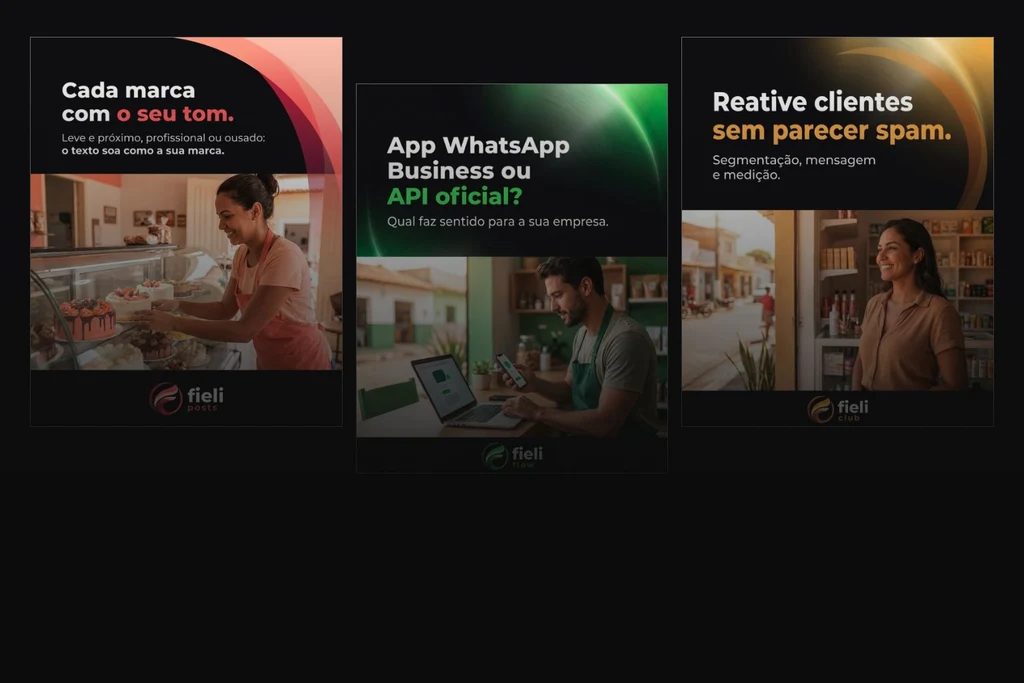
Cover the logo. Does it still feel like your brand?
Editorial composition by fieli studio using @fieli.tech posts reviewed on 9 October 2026. Original Portuguese artwork; scenes are not presented as real customers.
Explore brand identity beyond the logo through the Fieli family, then use a worksheet to compare colour, type, imagery and voice across three touchpoints.
By fieli studio
In 30 seconds
- Cover the logo on three pieces to inspect their continuity. The exercise reviews consistency; it does not measure audience recognition.
- On Fieli Tech's Instagram, colour highlights words, curves connect the layout and scenes establish context. The analysis uses real posts without inferring recognition or results.
- Compare your website, proposal and Instagram with the worksheet. Choose what to keep and one inconsistency to address before commissioning another logo.
Open your company website, a recent proposal and your latest Instagram post. Put them next to each other. Cover the name and logo for a moment. Do the three pieces still feel connected, or does the logo do all the work of identifying their source?
This exercise helps you examine brand identity beyond the logo: colour, typography, imagery and layout. Bring the words into the comparison and another question emerges: does the business sound like the same organisation, too?
Here we turn that observation into decisions. We unpack the Fieli family, separate consistency from recognition and offer a worksheet for reviewing three touchpoints before commissioning another logo.
What the exercise reveals, and what it cannot measure
Covering the logo is a way to inspect the rest of the identity. It is not advice to stop identifying your business in its communications.
It is also not a recognition test. Your team knows these materials intimately. A new customer may see a coherent design without linking it to your company. Someone else may recognise a piece because they have encountered the brand many times before.
The Ehrenberg-Bass Institute assesses distinctive assets through their association with a particular brand and their recognition among buyers. An element selected by a team still needs to build that connection in people’s memories.1
That leaves two separate questions: “do our materials belong together?” and “do people attribute these materials to our brand?”. An internal review can address the first. The second calls for audience research with an appropriate sample, context and method. Informal feedback can suggest a direction; it should not become an unsupported recognition percentage in a sales presentation.
The layers that remain beyond the logo
An identity has to work in an emailed proposal, on a narrow phone screen and in a feed that someone is scrolling through. Each setting needs its own hierarchy. The job is to decide what stays consistent and what can change.
Colour: a role, not just a code
A palette needs more than a list of colour values. It should explain where colours appear, how much space they occupy and how they work with type, images and backgrounds. Green may lead the website, almost disappear from the proposal and become a decorative detail in a post. Those pieces can share a palette without sharing a clear approach.
The proportions do not need to be identical. A light background may make a long document easier to read, while a large colour field gives a cover its structure. Specify the role before repeating the fill. Check contrast and legibility in each application.
Typography and layout: where attention goes
The same font does not guarantee the same hierarchy. Weight, scale, spacing, alignment and the relationship between heading and body copy also shape identity. A post may need a short, prominent headline; a proposal needs scope, fees and conditions that are easy to locate.
Compare one page from each touchpoint. Where does the eye start? How does a reader identify the main point? How are details grouped? If every line competes for attention, or every piece follows a different hierarchy, the review needs to go beyond font selection.
Imagery: a brief before a file
Image direction defines what to look for and how to show it: framing, light, people, distance, context and treatment. A photograph might explain a process, introduce the person doing the work or show a product in use. Choose its job before choosing its appearance.
Our article on photography and websites explores the relationship between images and presentation. Here the issue is continuity. Images from different sources can work together when the criteria are clear; they do not all need the same filter.
Voice: continuity in the words
Language is part of the experience. A business that sounds direct on Instagram, vague on its website and overly formal in proposals makes readers work harder to connect the pieces.
Define practical choices: the terms customers use, how much explanation you offer, the promises you can support and how you invite a next step. “Sound human” gives tomorrow’s writer little guidance. An approved example of a reply, headline and service description offers something they can use.
Adobe describes brand identity as a combination of expressions extending beyond a logo.3 The worksheet in this article is our practical application of that principle.
What Fieli Tech’s Instagram shows in practice
On @fieli.tech, identity starts working before the signature at the bottom. Across four posts selected on 9 October 2026, a dark field supports the message, a coloured curve moves through the composition and a phrase picks up the product’s colour. A work scene follows. The logo closes a sequence that has already established a visual relationship.
This is a selection, not a claim that all the posts are identical. The curves, lighting and balance between type and imagery vary. The useful question is which decisions carry through those changes.

Colour takes a role beyond the logo
The Fieli Posts example highlights “o seu tom” — your tone — in coral, echoed by clothing in the scene and the graphic bands. Flow uses green for “API oficial?” and elements in the scene. Tickets highlights “sem complicação” — without the complexity — in blue. Club uses amber for “sem parecer spam” — without looking like spam.4, 5, 6, 7
The important observation is colour’s repeated role: it helps separate products and emphasises a part of the message, rather than appearing only in the symbol. This is visible in the composition. It does not establish that a viewer would recognise Fieli from any one element alone.
Curves and hierarchy connect different subjects
The subject moves from brand voice to support, messaging or returning customers, but the covers maintain a relationship between a strong headline, a smaller supporting line, a scene and a signature. Curved bands carry a movement associated with the visual family without requiring an oversized symbol in every piece.
The second slide of the Flow carousel, inspected in the same review, keeps the arrangement: a brief instruction at the top, green emphasis, a work scene and the signature. It provides continuity as the information and image change.

The scene puts the subject in context
A bakery counter, a laptop and a support team place technology in the working day of a small business. The image direction is specific: people doing something, tools of the job and settings that participate in the message.
We do not present those scenes as documentary customer photography. In this analysis, they are elements of Fieli’s published creative. Their editorial role is to connect a subject with a situation, without proving real product use or results.
The words have a job
“Cada marca com o seu tom” introduces a choice about voice. “SLA de atendimento sem complicação” approaches a technical topic through the benefit of understanding it. “Reative clientes sem parecer spam” names a practical tension. Here we analyse the headlines’ construction; we are not validating every commercial or technical instruction in those posts.
Situation, explanation and next step have a relationship. That verbal structure matters alongside the colour. It can move between formats without repeating one headline everywhere. The original Portuguese artwork remains intact; these explanations are not replacement taglines.
One identity can adapt to different formats
In the Studio’s work, the Fieli family is presented through the symbol’s origin, its palettes and official lockups. On Instagram, those elements join shorter messages and work scenes. Each channel has a different role; the relationship between the elements can continue.
Tech uses red, yellow and blue. Posts, Flow, Tickets and Club inherit the geometry and each has its own palette. Form connects them; colour and name distinguish them. A shared identity does not require a website and a social post to use the same layout.
A proposal needs to make scope, conditions and fees easy to compare. Ask which choices of colour, hierarchy, imagery and voice carry through while serving that task. We did not inspect a real Fieli commercial proposal for this article; that third column is the reader’s exercise using their own material.
This is an in-house project, with products in development. We show identity in use without assigning unmeasured sales or recognition to it. The Studio’s mark identifies this article; the Tech pieces are documented examples, preserved in their original language.
A worksheet for your website, proposal and Instagram
Choose recent, real materials. In each cell, record evidence: a colour in use, a phrase, a crop or the position of a contact link. Labels such as “good”, “bad” or “modern” tell you very little about what to do next.
On a phone, swipe across the table to read all the columns.
| Layer | Website | Proposal | |
|---|---|---|---|
| Colour and contrast | How does the palette organise content and action? | Are copy, fees and conditions readable? | Does colour retain its role in the feed? |
| Type and hierarchy | What do you read first? | Are scope and detail clearly ordered? | Does the main message work on a phone? |
| Imagery and layout | Do images explain the offer? | Do examples help someone decide? | Does the crop preserve meaning and identity? |
| Voice and promise | Is the offer understandable? | Does the agreement match the presentation? | Does the destination deliver what the post promises? |
| Logo and continuity | Are the version and proportions correct? | Are files and contact details current? | Is the business clearly identified after cropping? |
Download the CSV worksheet to open in a spreadsheet, or use the plain-text version. No registration is required. This is a Studio working tool, not a validated brand-strength scale.
When you finish, choose one inconsistency that makes something harder to understand and one decision worth keeping. Working with both prevents a review from becoming a wholesale reset. The proposal’s hierarchy may need attention well before the symbol does.
Consistency with room to create
A defined identity supports variation. A campaign can have its own pace, a proposal can be restrained and a page can give priority to photography. A few stable elements and clear rules keep those decisions connected.
The risk comes when every production starts the brand again: a new colour to look fresh, a new font because it is fashionable, or a different voice depending on who is writing. A useful system sets out where variation is welcome and where continuity matters.
Ehrenberg-Bass guidance emphasises continued use to maintain and build brand associations. The range of assets also needs to reflect the resources available to support them.2
That calls for discipline, not a frozen identity. Changes in the offer, audience or experience may justify evolution. Start with what needs solving and what deserves to remain. Our guide to Studio services helps distinguish work on voice, identity and digital experience.
The next decision may be smaller than you expect
The exercise does not have to lead to a rebrand. It may lead to organising official files, defining two typographic hierarchies, updating imagery or writing examples that help a team work without guessing.
If the materials belong together, protect that foundation and investigate how people receive it before changing it out of familiarity fatigue. If each piece tells a different story, trace the cause: missing guidance, outdated assets, execution or an unresolved strategic choice.
Put your website, a proposal and a post together. What should carry through all three, but currently gets lost? The worksheet helps organise your answer. If you would like to work on the challenge with the Studio, send us the context. Remove confidential third-party information before sharing commercial documents.
Frequently asked questions
Is brand identity the same as a logo?
A logo is one element of visual identity. Colour, type, imagery and layout also contribute. Brand identity is broader and includes voice and other forms of expression.
Should I remove the logo from my posts?
Not because of this exercise. Covering the logo helps you examine the other elements. Published communication should continue to identify the brand appropriately.
Is a consistent brand already recognised?
Not necessarily. Consistency describes the relationship between materials. Recognition depends on what the audience has learned and needs an appropriate research method.
Do inconsistent materials mean I need a rebrand?
Investigate the cause first. Files, guidance, hierarchy and content may need attention without requiring a new symbol or an entirely new identity.
Sources
- Ehrenberg-Bass Institute — Brands of Distinction (Accessed 09/10/2026)
- Ehrenberg-Bass Institute — Q&A: Seven Costly Sins of Brand Identity (Accessed 09/10/2026)
- Adobe — What Is Brand Identity? (Accessed 09/10/2026)
- Fieli Tech — Instagram / Posts (Accessed 09/10/2026)
- Fieli Tech — Instagram / Flow (Accessed 09/10/2026)
- Fieli Tech — Instagram / Tickets (Accessed 09/10/2026)
- Fieli Tech — Instagram / Club (Accessed 09/10/2026)
Updated .
How we made this note: AI-assisted research, every source opened and checked, writing and review by fieli studio.