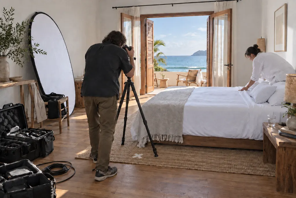
You paid for the photo. Your website didn't.
Illustrative image created with AI.
Hotels and restaurants invest in first-rate photography, then the website shrinks it into a grid. What research says about size, speed and getting photos to sell again.
By Pira Abs · fieli studio
In 30 seconds
- Professional photography has a measured effect: in a study of 7,423 lodging listings, professional photos raised occupancy by 8.98%.
- Size counts: large photos heighten the sense of being there, the intention to book and the willingness to pay more. A thumbnail grid throws all of that away.
- So does speed: on mobile, a website 0.1 s faster drove 10.1% more travel conversions. The answer is large photos that load fast, in a sequence that tells a story.
The shoot was expensive. Where did it end up?
A specialist photographer, days of production, a drone, the light at just the right hour, the room styled as if for its very first night, the dish plated three times until it was perfect. High-end hotels and fine restaurants invest in imagery as few other industries do.
Then the photos reach the website. And often they turn into thumbnails in a grid, cropped to whatever format the template allows, compressed until the texture is gone, tucked behind a “view gallery” link. The photo that made a guest dream ends up the size of a postage stamp.
No one is being careless. It’s simply the path of least resistance for a standard website. But that’s exactly where the investment gets lost, and it’s also why it’s so easy to win back.
Eyes go to the images first
In a Cornell University eye-tracking study, people choosing from a shortlist of hotels looked at the images more than at any other element on the page, even more than at the reviews.4
In usability testing of online store product pages, the Baymard Institute found that the first thing 56% of people did was explore the images. Small images, or images without zoom, drove people away.5
The photo is your first conversation with the guest. Its size sets the tone of voice.
Professional photography has a measured effect
It sells, and one study measures by how much. Research published in Management Science followed 7,423 lodging listings for 16 months. Those that switched to professional photos had 8.98% higher occupancy than those that kept the host’s own photos, using a research design that points to cause, not just coincidence.1
The same study identified what the best-performing photos had in common, such as composition and image quality. In other words, good photography works. The question is whether the website lets it do its job.
Large photos let guests picture themselves there
Size makes a difference. A study of 247 people, published in the International Journal of Hospitality Management, showed that large photos strengthen the feeling of “being there”. That feeling, in turn, raises the intention to book and the willingness to pay more. One intriguing detail: the large photo worked better without people, because guests can put themselves in the scene.2
Another study in the same journal, with 572 people, showed that more photos make browsing more pleasant, and that this pleasure translates into intention to book. Text that runs too long, on the other hand, causes stress.3
Together, the two studies point in a clear direction: large images with room to breathe, and short text alongside. That’s the exact opposite of a thumbnail grid with a long paragraph underneath.
Why photos shrink on websites
For the same reasons every hotel website looks alike: each decision, on its own, makes sense.
- A grid takes any number of photos. It’s practical for whoever updates the website, so it becomes the default.
- The template sets the format. A landscape photo shot for a magazine gets cropped into a square or a strip, and no one decides what gets left out.
- Fear of file size. To keep the website from slowing down, the photo is compressed until it loses the texture that justified the shoot.
- The gallery becomes an archive. Eighty photos, all given the same weight. When everything is on show, nothing stands out.
- Mobile comes last. The photo that works on a desktop screen gets cut off on the phone, with no one choosing the crop.
None of these reasons is carelessness, and all of them have known fixes. What’s usually missing is someone looking at the website with the right question: what does this photo need to do its job?
Homepage video: is it worth the weight?
Full-screen homepage video has become the norm. It can be beautiful, but it’s heavy. Google rates a page as good when its largest element appears within 2.5 seconds, and a video’s poster image or first frame counts toward that.6 Google itself notes that autoplaying video starts downloading immediately, and recommends using it sparingly.7
On mobile, only 62% of web pages hit that mark.9 And speed is money: in a Deloitte study, a travel website that was 0.1 seconds faster on mobile saw 10.1% more conversions.8
That doesn’t mean giving up video. It means the first image has to load fast, and whatever is beautiful and heavy waits its turn.

A website that does the photos justice, in practice
A made-up example, for illustration. A twelve-table restaurant in a historic town, photographed at dusk: the open kitchen, the chef’s hands, light coming through the old window, the dish arriving at the table.
On the standard website, those photos would sit in a grid of nine squares, below a carousel and a paragraph about “a unique dining experience”.
On a website that does the photos justice, the phone would open on the old window, full screen, already cropped for a screen held upright. As you scroll, the evening would unfold in the order it actually happens: the street, the door, the kitchen, the hands, the dish, the empty table at the end. One short caption per image, not a paragraph. On a large desktop screen, the same photos would get even more room. Booking would always be one tap away. And the first image would appear fast, because each photo would load at the right size for each screen.

The photos would be the same. The difference is that, for the first time, people would actually see them.
What changes for the business
We don’t promise numbers before we know the place. But the studies above show where the effect lies.
- The investment you already made starts paying off. The shoot you paid for stops being an archive and becomes your main selling point.
- Guests picture themselves there before booking. That sense of presence is what, in the research, leads to the intention to book and the willingness to pay more.
- The first impression lands before guests give up. A website that’s fast on a phone is part of the experience, not a technical detail.
- Your images work for you on Google, too. Well-described, consistent photos help search engines, AI assistants and people using screen readers understand what the place offers.
5 fixes to make your photos sell again
None of them needs a new shoot. Each one comes with a one-minute check, phone in hand.
Open with your best photo, full screen.
The strongest image from the shoot should be the first thing people see, filling the phone screen, not the twelfth photo in the gallery.
How to check Open the website on your phone. Does the first photo fill the whole screen? Is it the best one you have?
Crop for a screen held upright.
A landscape photo cropped automatically loses what matters. Every key photo deserves one crop chosen for phones and another for desktop.
How to check Swipe through your key photos on a phone. Does any of them cut off half the view, the dish or the bed?
Make the first image load fast.
Guests on their phones won't wait. The first image should appear within 2.5 seconds; video and anything else heavy can come later.
How to check Paste your website address into Google's PageSpeed Insights and check the mobile “Largest Contentful Paint” time.
Swap the grid for a sequence.
Your best photos, in an order that tells the story of the stay: arrival, room, table, night. A story sticks in the memory; a pile of thumbnails doesn't.
How to check Go through the gallery from start to finish. Does it have a beginning, a middle and an end, or is it just a pile of squares?
Give each photo a caption and a description.
A short caption tells guests what they'll feel there. Alt text tells search engines, AI assistants and screen readers what the photo shows.
How to check Pick three key photos. Does each one have a visible caption and a text description?
Frequently asked questions
Is a homepage video a mistake?
No. Video can be beautiful and say a lot. What needs care is the weight: Google points out that autoplaying video starts downloading right away, and the first image has to appear fast, especially on a phone. A well-prepared video with a lightweight first frame can coexist with a fast website.
Do I need a new photo shoot?
It's rarely the first step. In most cases the good material already exists and is underused: too small, cropped at random or hidden away in a gallery. First make the most of what you have; then see what's missing.
Don't large photos make a website slow?
They don't have to. Modern image formats and different sizes for each screen keep a large, sharp photo light. What makes a website slow is loading everything at once, at the wrong size.
How many photos should a website have?
There's no right number. One study found that more photos make browsing more pleasant. Our reading is that the effect depends on the photos actually being seen: a well-chosen sequence, large and in order, tends to work better than a gallery where everything carries the same weight.
Does this apply to restaurants too?
It does, perhaps even more. In a restaurant, the photo of the dish, the light and the table is what makes someone book. Most of the studies cited here are about lodging; the ones on browsing behavior and speed come from online retail and travel. The logic of attention, size and speed is the same.
Sources
- Zhang, Lee, Singh and Srinivasan — What makes a good image? Airbnb demand analytics leveraging interpretable image features (Management Science) (December 20, 2021)
- Back et al. — study on photo size on hotel websites, sense of presence and booking intention (International Journal of Hospitality Management, vol. 89, art. 102545) (May 25, 2020)
- Bufquin et al. — Effects of hotel website photographs and length of textual descriptions on viewers' emotions and behavioral intentions (IJHM, vol. 86) (September 24, 2019)
- Noone and Robson — Using eye tracking to obtain a deeper understanding of what drives online hotel choice (Cornell University) (September 2, 2014)
- Baymard Institute — Ensure sufficient image resolution and zoom (usability testing) (April 2, 2020)
- Google web.dev — Largest Contentful Paint (LCP) (September 4, 2025)
- Google web.dev — Video performance (April 2, 2026)
- Deloitte — Milliseconds Make Millions (commissioned by Google) (March 24, 2020)
- HTTP Archive — Web Almanac 2025, Performance chapter (January 15, 2026)
Updated .
How we made this note: AI-assisted research, every source opened and checked, writing and review by fieli studio.