Before and after a website redesign: what actually improved?
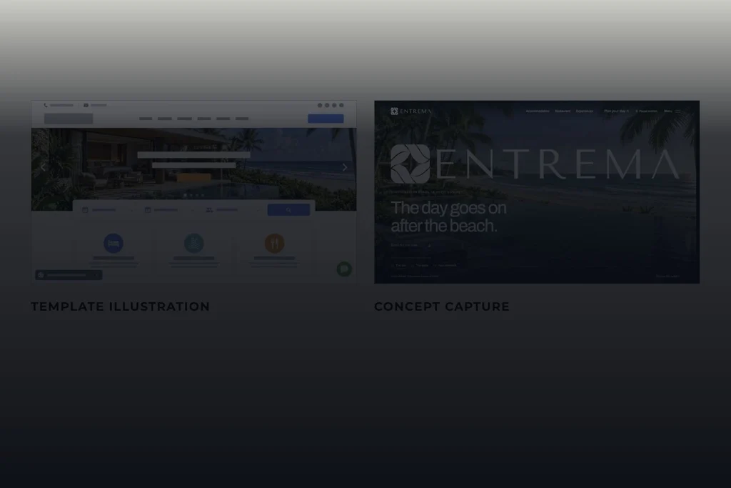
Composition using fieli studio comparison materials. AI-generated template illustration and capture of ENTREMA, a fictional hotel; not a client case study.
It looks better. Is it easier to use? Review a redesign through understanding, choice and next steps, with concept examples and a practical worksheet.
By Karl Belowodski · fieli studio
In 30 seconds
- A visual comparison demonstrates presentation decisions, not proven usability, speed or conversion gains.
- Understand, choose and continue turn opinions into questions that can be observed.
- ENTREMA is a fictional hotel concept illustrating the method; a worksheet records evidence and what still needs testing.
The new website fills the screen. The photography is larger, the typography has changed and the motion catches the eye. The presentation ends with a familiar pair of labels: before and after.
One question remains: what can someone do more easily now? A redesign may express the brand more clearly and support a decision. Evaluating that requires attention to content and use. This article offers three lenses — understand, choose and continue — and a worksheet for moving from visual impressions to observations you can check.
Start by establishing what the comparison shows
The fieli studio comparison places an illustrative template image beside captures of ENTREMA. The first is AI-generated; the second shows our fictional hotel concept. It demonstrates creative direction, rather than a client’s project history or a conversion experiment.1

The comparison can support a discussion about composition, brand presence and visual priorities. It cannot measure the technical performance of two implementations, because the illustrative side is not a working website. Nor does an image establish the technology, security or booking costs behind a design.
Templates and bespoke projects can both be well or poorly resolved. The useful question is which decisions serve the business, audience and task. Replacing a ready-made component with custom code is not, on its own, evidence of an improvement.
Nielsen Norman Group frames design critique around the work’s objectives. Without a clear problem and user need, feedback tends to depend on personal preference.2 That distinction grounds our review method.
Understand: does the opening provide context?
Someone unfamiliar with the business needs to establish where they have arrived and why it may be relevant. The name, imagery, copy and navigation should contribute to that understanding. ENTREMA’s brand name, coastal setting and chapter-based journey are part of that presentation.
A practical question is how a visitor would describe what they found after exploring the opening. Ask them to use their own words, without supplying the answer. Notice whether they identify the type of place, its proposition and the available paths. Praising the photograph does not answer those questions by itself.
For a service business, the review might focus on the offer, intended customers and examples of work. For a product, it could focus on purpose, availability and what is a demonstration. The content changes, but the need for context remains.
An annotated detail can make a decision visible: does the heading explain the subject? Does the caption resolve an ambiguity? Do the navigation labels use familiar terms? Record the design decision separately from what still needs to be observed with people.
Choose: are relevant differences easy to find?
Once someone understands the proposition, they may need to compare options. The ENTREMA accommodation page offers a comparison of Jardim, Horizonte and Encontro, including guests, beds, setting and privacy.3 It is a content decision: equivalent criteria support different questions.

An illustrative task could be: “You are travelling with three other people. Find an arrangement where the group can stay together and check how the beds are distributed.” Avoid replacing it with “click Encontro”, which gives away the route you want to investigate.
Observe where the person looks, what they compare and what they have to infer. If they find an answer, record which information supported it. If they do not, record the gap. A single observation should not become a success rate for the whole audience.
The approach also applies to plans, services and projects: relevant differences should support the choice. Our article on hotel websites and guest enquiries looks more closely at what can be explained before contact.
Continue: does the action explain what happens next?
A visible button still needs a coherent destination. “Explore the house”, “Plan your stay” and “Discuss a project” set different expectations. Check that the action label matches the step that follows.
In the ENTREMA concept, planning a stay allows visitors to explore preferences. It does not confirm availability, a rate or a booking. Someone using the demonstration should be able to understand that distinction. The same care applies to a real form: is the person sending an enquiry, entering an agreement or starting a conversation?
Review the whole route without making unnecessary payments or submissions. Check feedback, ways to correct information and the behaviour of the back action. A screenshot of a button cannot establish that the journey works.
What a screenshot cannot demonstrate
A still image does not test keyboard operation, control sizes, zoomed text, touch response or reduced motion. These need to be examined in a working site under defined conditions.
W3C explains that visible focus helps keyboard users identify the selected element.4 Move through controls using Tab and observe the indicator. That is a useful check, not a complete accessibility audit.
Performance also requires measurement. Core Web Vitals address loading, interaction responsiveness and visual stability.5 A design that looks lighter is not necessarily faster. Record the page, device and test conditions, and distinguish laboratory measurements from real-user data when available.
Preference and successful use require different evidence
Nielsen Norman Group distinguishes approaches to visual perception from methods that observe behaviour.6 Asking which version someone prefers can inform a brand discussion. Investigating use requires watching a task.
Define the objective, use comparable versions and avoid teaching the route during the activity. If one person sees both versions, the first can teach them how to use the second; presentation order matters. NN/g’s usability-testing guide also discusses tasks and instructions that avoid steering the answer.7
A useful finding does not need a dramatic percentage. “The participant looked for occupancy in the description and only found it in the comparison” is a concrete observation. It supports a hypothesis to revise and check again. A claim about increased conversion needs appropriate measurement, context and a suitable sample.
A worksheet for discussing your next website
Download the task-based review worksheet. It covers understanding, choosing and continuing, alongside interaction checks. Fields capture the objective, observed evidence, unresolved questions and the next action. There is no automated score that declares a website good or bad.
Use it with your team, when preparing a website brief or when reviewing a redesign proposal. Separate what the comparison demonstrates from what is a hypothesis and what has not been tested. That helps make priorities and investment discussions more concrete.
Appearance deserves care. The question that completes a before-and-after presentation is what that care helps people understand, choose and do.
Five checks before approving the after
Use the worksheet to record what you observed and what still needs testing.
Choose a task.
Describe what someone needs to accomplish without naming the control to use.
How to check Does the instruction state an intention or give away the answer?
Check the context.
Observe how someone describes the offer after exploring the page.
How to check Can they explain what they found in their own words?
Follow the choice.
Record which information supports comparison between options.
How to check Are capacity, conditions or other relevant criteria available when needed?
Follow the action.
Check the destination and feedback for each important call to action.
How to check Does the button deliver the step its label suggests?
Go beyond the screenshot.
Review mobile use, keyboard, zoom and performance under recorded conditions.
How to check Does the record separate observed problems from unmeasured outcomes?
Frequently asked questions
Does a before-and-after comparison prove higher conversion?
No. A visual comparison does not measure conversion. That claim needs data, context and an appropriate method for evaluating the change.
Does a template prevent good design?
No. Quality depends on how content, identity, interaction and functionality serve the audience and task. Custom code alone is not proof of quality either.
Can I test with images alone?
Images can help explore perception and expectations, but they cannot verify a complete journey, responsiveness or a working website.
Is ENTREMA a real hotel?
No. It is a fieli studio hotel concept with AI-generated imagery. Captures illustrate design decisions, not actual reservations or commercial results.
Sources
- fieli studio — concept comparison (Accessed 13 October 2026)
- Nielsen Norman Group — Design Critiques (Accessed 13 October 2026)
- ENTREMA — casas (Accessed 13 October 2026)
- W3C — Understanding Focus Visible (Accessed 13 October 2026)
- web.dev — Web Vitals (Accessed 13 October 2026)
- Nielsen Norman Group — Testing Visual Design (Accessed 13 October 2026)
- Nielsen Norman Group — Usability Testing 101 (Accessed 13 October 2026)
Updated .
How we made this note: AI-assisted research, every source opened and checked, writing and review by fieli studio.