From Instagram to your website: does the brand carry through?
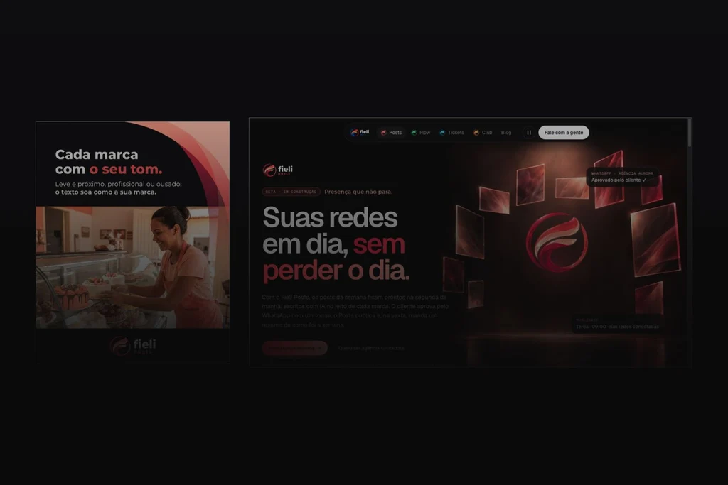
Composition by fieli studio using an @fieli.tech post and a fieli.app capture from 9 October 2026. Original Portuguese artwork; illustrative scenes and demonstrations.
Follow the connection between Instagram and Fieli Tech’s website. Compare identity, expectations and next steps with a practical continuity worksheet.
By fieli studio
In 30 seconds
- Part 2 of Identity in use moves from individual pieces to the connection between Instagram and a website.
- Posts and Flow show related visual choices across formats. Consistent identity does not replace a destination that delivers the promised subject.
- The worksheet asks what you expected, what confirms you have arrived and what you can do next.
The post caught someone’s attention. They opened the profile and followed a link to the website. Now they want confirmation: am I in the right place? Is the thing that interested me here? What can I do next?
Brand consistency across Instagram and a website is tested in that gap. Colour can carry through, but the information needs to move forward. A strong headline loses its purpose when the destination makes someone start their search again.
In part one, we examined identity beyond the logo. Here we compare Fieli Tech posts with the Posts and Flow pages to ask what stays, what changes and what happens next. The pages were reviewed on 9 October 2026. This is an editorial comparison, not an analytics record of a customer’s journey.
The brand has to carry through the click
The name and logo help confirm the source. The offer, vocabulary, imagery and next step matter as well. A post can introduce a specific solution while its destination requires the reader to search for it all over again.
Nielsen Norman Group describes a link as a promise: its wording creates an expectation that the destination should fulfil.1 That gives us a practical review method. Read the call to action without the rest of the campaign, open the destination and look for what you expected. Record what you found and what you had to infer.
There are two layers to check. Identity: do the choices belong together? Task continuity: can the person move forward with the subject that brought them here? A website can match a post’s colours and still leave that second question unanswered.
Posts: from a short message to an explanation
The “Cada marca com o seu tom” post examined in part one introduces brand voice with coral emphasis, a dark background, curves and a bakery scene. On the Fieli Posts page, coral also organises emphasis, actions and atmosphere. The family signature remains while the layout makes room for a longer explanation.3, 5

The post introduces a choice about voice. The page develops it through an illustrative sequence: choose a tone, assemble a content schedule and represent approval. In the version reviewed, the controls and demonstration make the idea something a visitor can explore. A website can offer an interaction that a static image cannot.
This does not mean the observed post links directly to that demonstration. Its caption points to the profile link, which introduces Fieli. We are comparing brand expressions. A campaign promising an opportunity to try the example would need its route configured and checked all the way to the specific destination.
The page labels Posts as under construction and the demonstration as an illustration with fictional data. Interacting with a website presentation is not evidence of using a commercially available product. The example demonstrates design and communication in use.
Flow: a different colour, related choices
In the Flow post about WhatsApp Business and the API, green highlights part of the question and appears in the scene. On the Flow page, it contributes to the headline, atmosphere and representation of the system. The post places the subject in a working day; the website uses a digital composition to explain the product.4, 6

Continuity comes from related decisions, rather than repeating the photograph. Background, hierarchy and the use of colour connect the pieces. The page has room to expand conditions, examples and actions.
There is an important difference in intent. The post discusses choosing between the app and API and points readers towards a blog guide. A product page has a different job. If someone wants the guide, a sales presentation does not fulfil that promise. Visual consistency cannot repair the wrong destination.
This limit makes the example more useful: the visual family connects the communication, but the right address depends on each post’s subject and invitation. We do not need to invent a perfect journey to explain how to review a real one.
Consistency does not require the same layout everywhere
Instagram and websites create different reading conditions. A card can concentrate on a question. A page can organise answers, show alternatives and support an action. Identity needs to work with those differences.
Nielsen Norman Group’s research on cross-channel experiences discusses consistency across visual characteristics, language and functionality.2 Our practical application is to define what should remain identifiable and what must adapt to help someone complete their task.
On a phone, swipe across the table to compare the columns.
| Decision | Preserve | Adapt |
|---|---|---|
| Colour and form | Relationships that identify the family and product | Colour area, contrast, crop and motion |
| Voice | A truthful offer, vocabulary and way of explaining | Length, detail and order of answers |
| Imagery | Direction and relevance to the subject | Photography, demonstration or composition for the task |
| Call to action | The expectation of what comes next | Button wording and specific destination |
| Information | Compatible facts and conditions | The depth each stage needs |
A large rendered symbol is still a logo application. To examine what exists beyond it, also look at hierarchy, verbal rhythm, colour roles and guidance. Strong identification and a broader design language can work together.
Three questions for the journey
Choose one post and write its promise in a sentence. Open the link as a visitor, preferably on a phone. Avoid filling the gaps with what you already know about your business.
1. What did I expect to find? A guide, a product, examples, information or a conversation? “Learn about” and “try” suggest different experiences. If the destination is ambiguous, start with the invitation.
2. What confirms that I have arrived? Look for a heading, context, information and identification. The answer may be on a clear opening screen or along an obvious navigation route. If it takes an extended search, the page is asking for additional effort.
3. What can I do now? Does the button explain the next step? Does the action work? Is there enough context to decide? Contact may be appropriate; a promised resource needs to be available before you advertise it as such.
Download the plain-text continuity worksheet. It records the promise, destination, confirmation and next step. The output is evidence for a review, not a conversion score or automated diagnosis.
The fix may be small: a different destination, a more descriptive button or an answer placed where it is easier to find. In other cases, the offer itself needs work. The Studio services guide helps separate voice, identity and digital experience before defining scope.
One brand, from one encounter to the next
Part one asked what remains when we cover the logo. This article asks what remains when we follow a link. Together, they examine identity within each piece and continuity between pieces.
The Fieli examples show related choices without an identical composition everywhere. They also show why destination intent matters alongside appearance. Products in development and illustrative demonstrations remain identified as such. This article does not claim commercial results for the system.
After a change, observe comparable evidence: arrivals through the intended link, meaningful interaction and received enquiries. A visit does not prove understanding; a WhatsApp click does not prove a sent message. User research and follow-up in the actual enquiry process help interpret what counts alone cannot explain.
Someone changed channels. They should not have to restart the conversation. Follow one of your company’s posts to its destination. Finding where continuity breaks gives you a specific challenge to work on.
Frequently asked questions
Should a website and Instagram use the same layout?
No. The formats have different jobs. Colour, voice and visual criteria can remain connected as layout and depth change.
Does visual consistency guarantee conversions?
No. Destination, offer, information and functionality also matter. This article is an editorial analysis, with no conversion results attributed to design.
Should every link go to the homepage?
The destination should fulfil the invitation. A guide needs a route to the guide; an introduction to the business may belong on the homepage. Review the specific journey.
Is the Posts demonstration the real product?
The reviewed page identifies the demonstration as an illustration with fictional data and Posts as under construction. The article examines its public presentation.
Sources
- Nielsen Norman Group — A Link Is a Promise (Accessed 9 October 2026)
- Nielsen Norman Group — Consistency in the Omnichannel Experience (Accessed 9 October 2026)
- Fieli Posts — website (Accessed 9 October 2026)
- Fieli Flow — website (Accessed 9 October 2026)
- Fieli Tech — Instagram / Posts (Accessed 9 October 2026)
- Fieli Tech — Instagram / Flow (Accessed 9 October 2026)
Updated .
How we made this note: AI-assisted research, every source opened and checked, writing and review by fieli studio.